


The Type-Face project
_
Beauties of forgotten typefaces
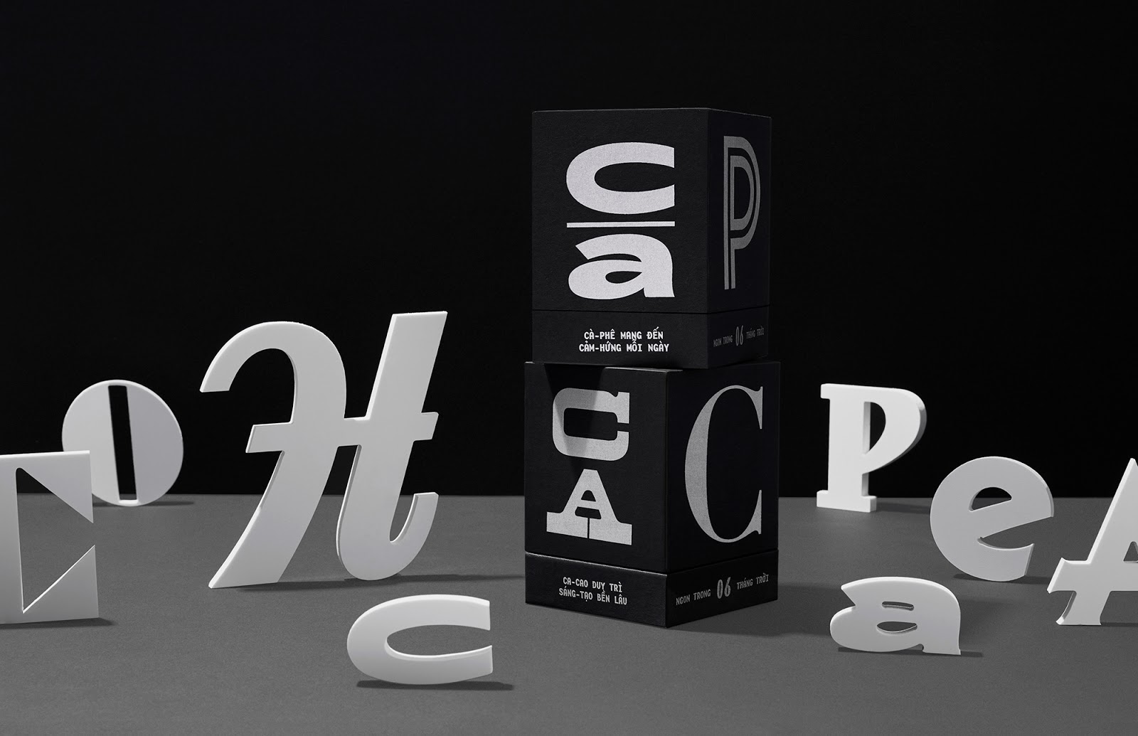
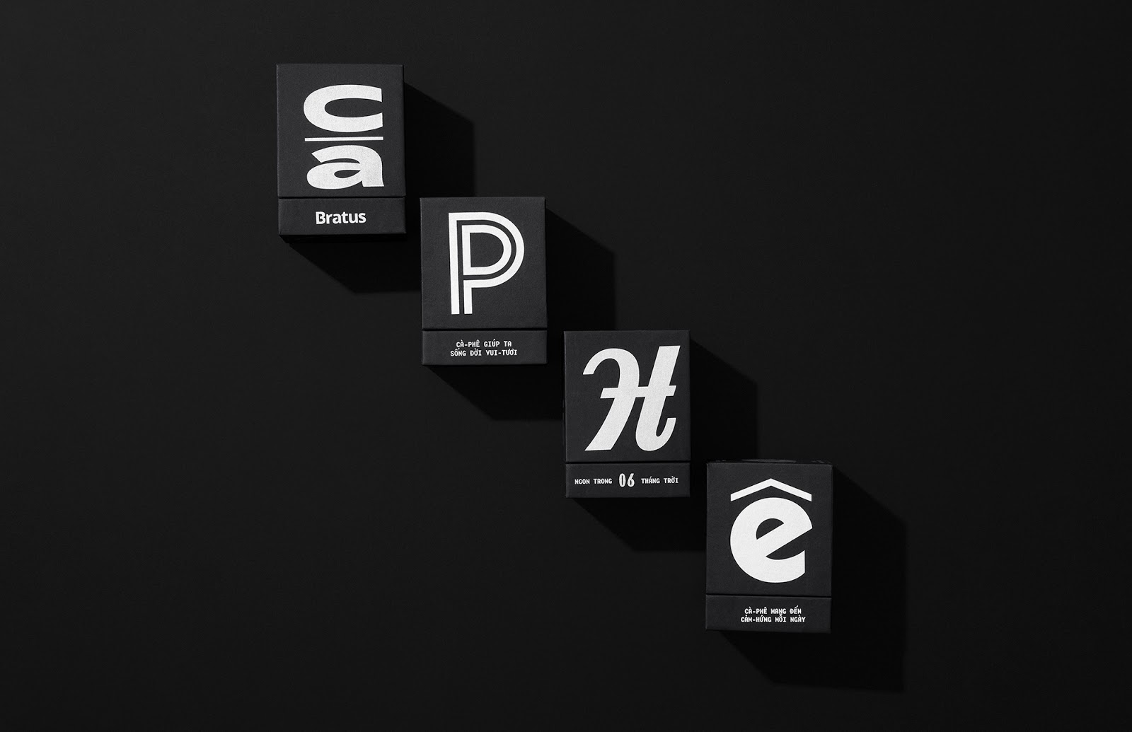
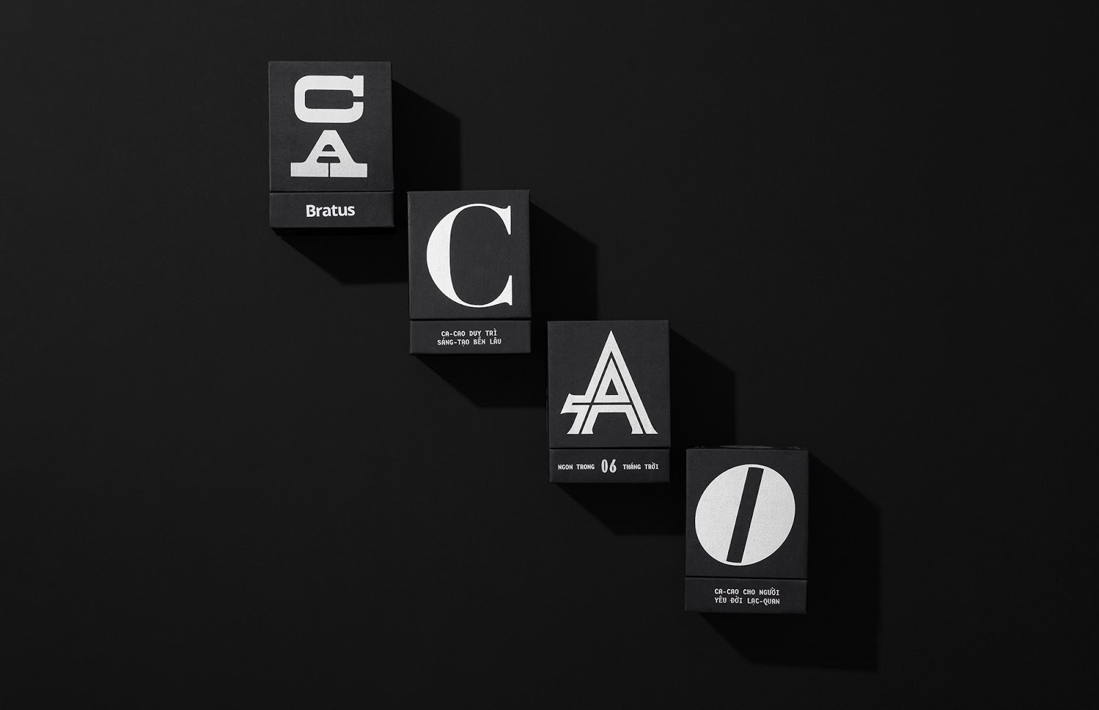
The main purpose of Mặt chữ (Type-faces) is to establish a packaging system for coffee and cacao gifts, belonging to Von Viet Project and Bratus. Inspired from the daily coffee and cacao habits in the past, we look back and re-consider the colonial cultural highlights and Indochine design factors in Vietnam’s twentieth century. At the end of the research, I decided to revive the elegance of Vietnamese typefaces in the past – the forgotten cultural heritage.
主要目的是建立一个咖啡和可可豆礼品的包装系统,属于Von Viete项目和Bratus。我们从过去的日常咖啡和可可习惯中汲取灵感,回顾并重新思考越南20世纪的殖民文化亮点和印支派设计因素。在研究的最后,我决定恢复越南字体在过去的优雅-被遗忘的文化遗产。


Approaches
“Honoring the interesting characteristics and essences of the antique typefaces”
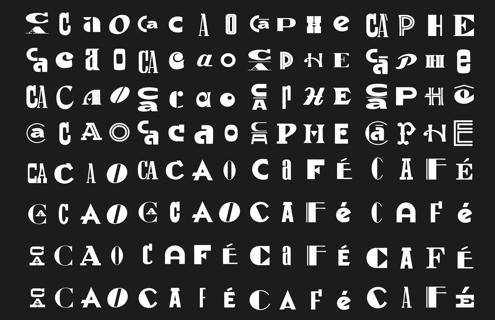
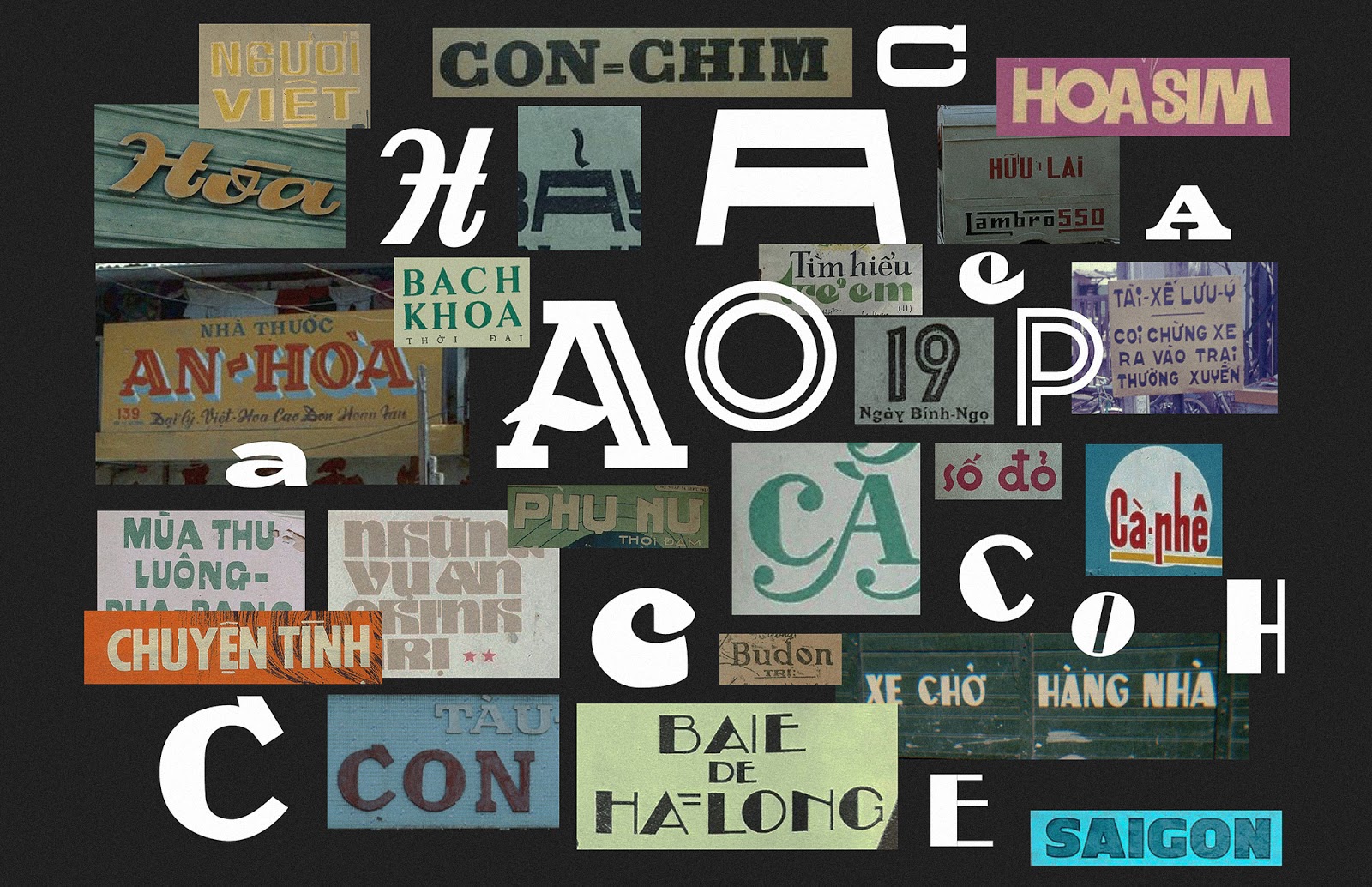
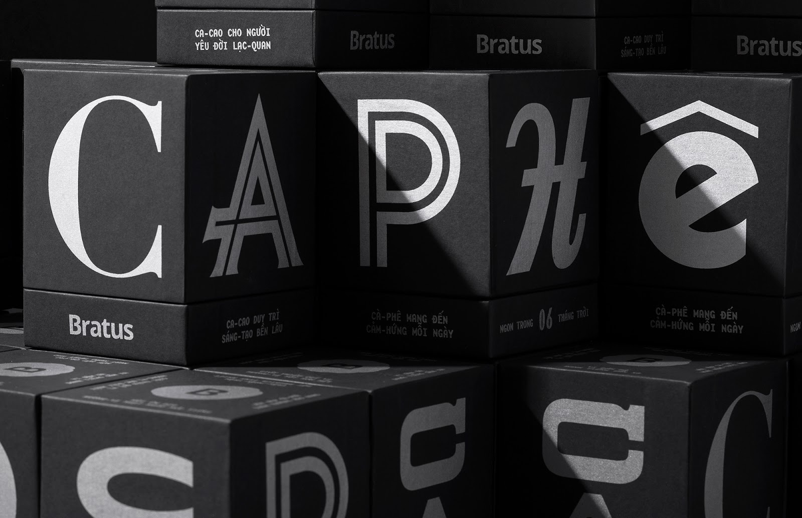
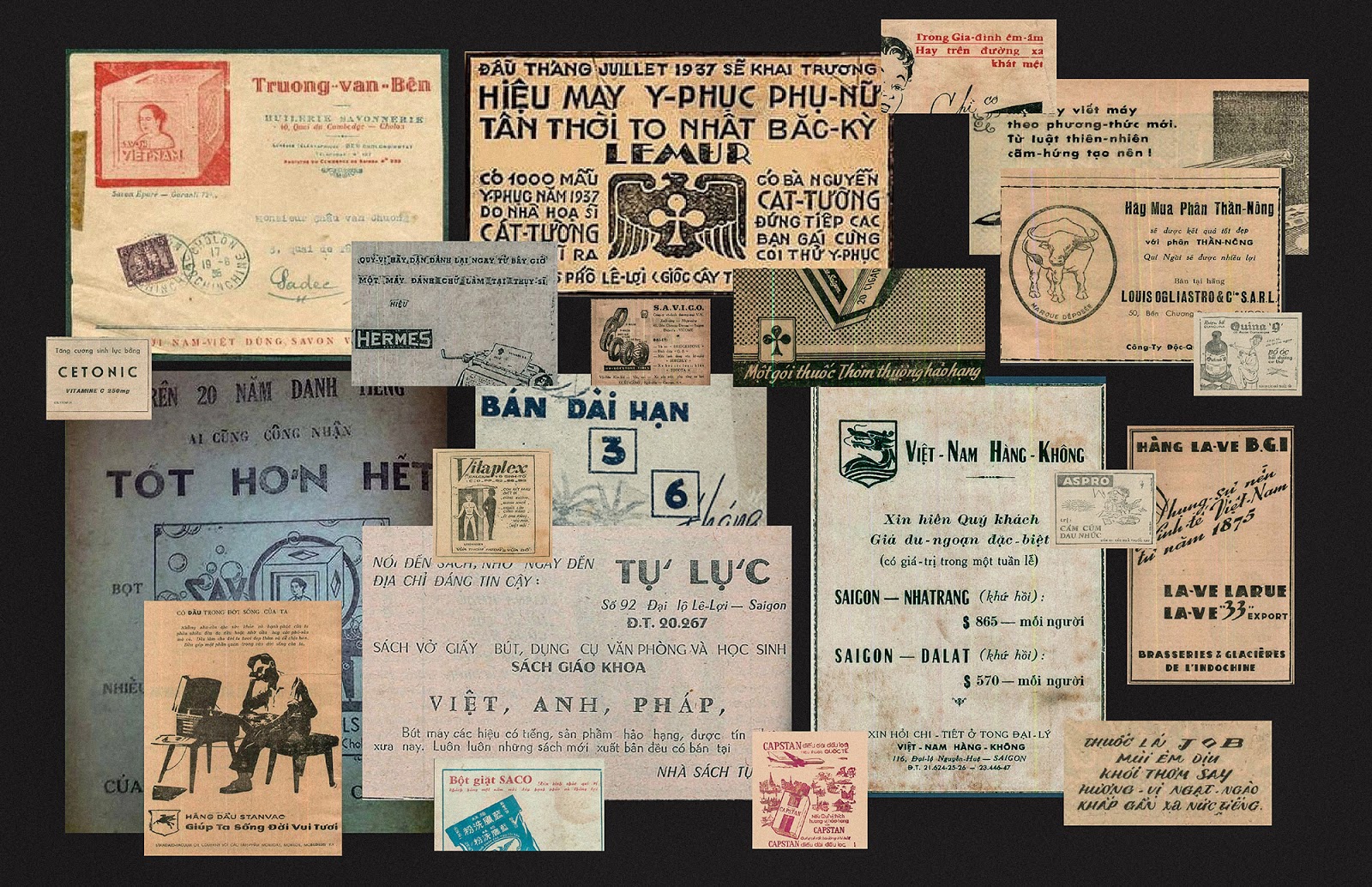
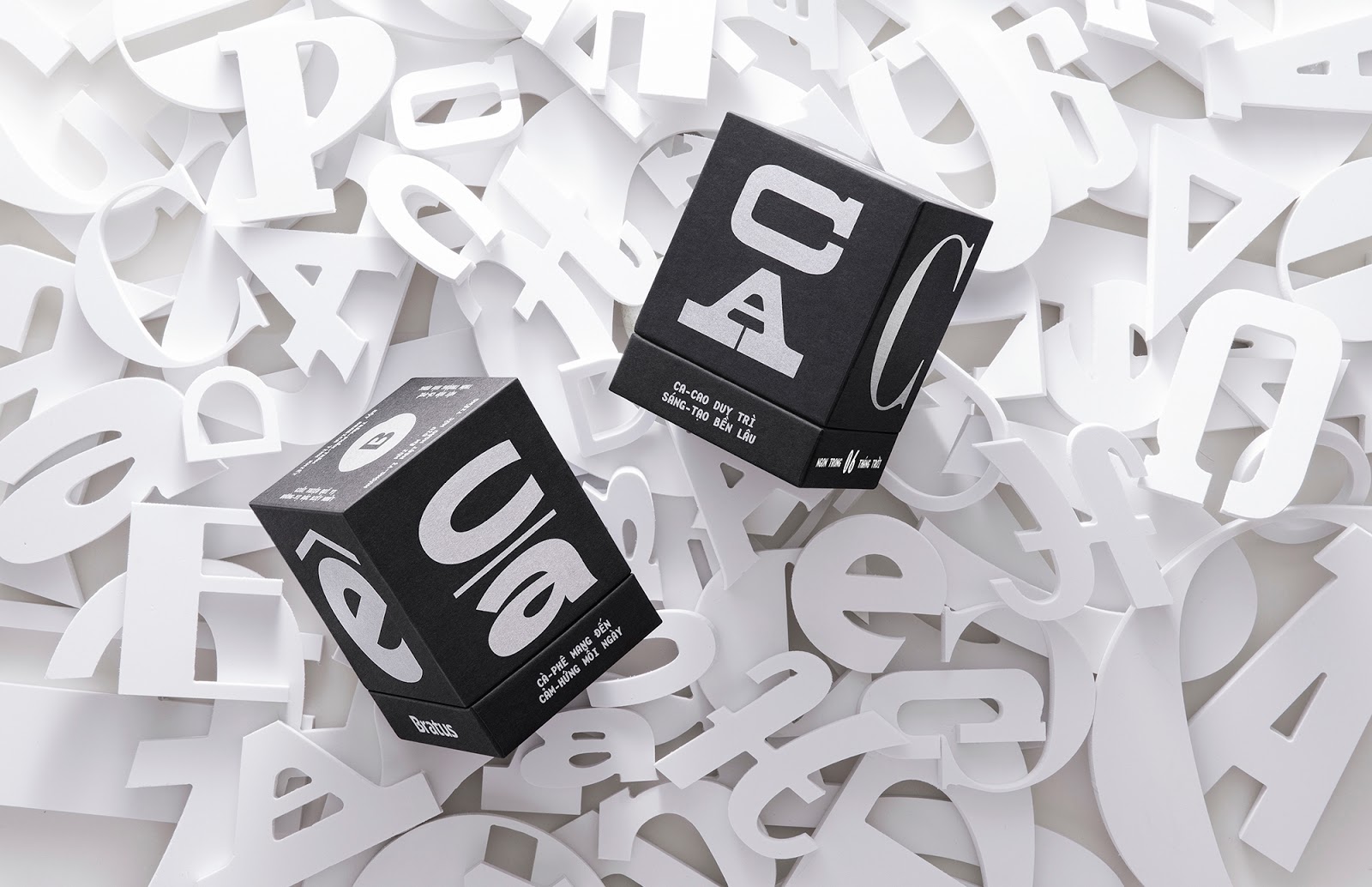
Our design process is the journey back to the past to collect and resurrect the most popular and outstanding typefaces lasting in Saigon before 1975. We were so eager to discover individual letters from the internet, documents, books, magazines, old store banners, and archived resources. This primary research prepares a diverse collection of typefaces, ready for our experiments and exploration.
The Contents
To match the content with a visual concept, we studied how old Saigoneses feature their product on newspaper ads, then drafted up our advertising for the coffee and cacao packagings. The package content required the precise and funny compilation, that’s why we imitated the wordplay and poetic writing, as well as previous Vietnamese vocabulary. As a result, the content delivers a verbal announcement of the products with familiar, rustic, and exciting messages.
Concept Design
“This packaging is a gallery of typefaces”
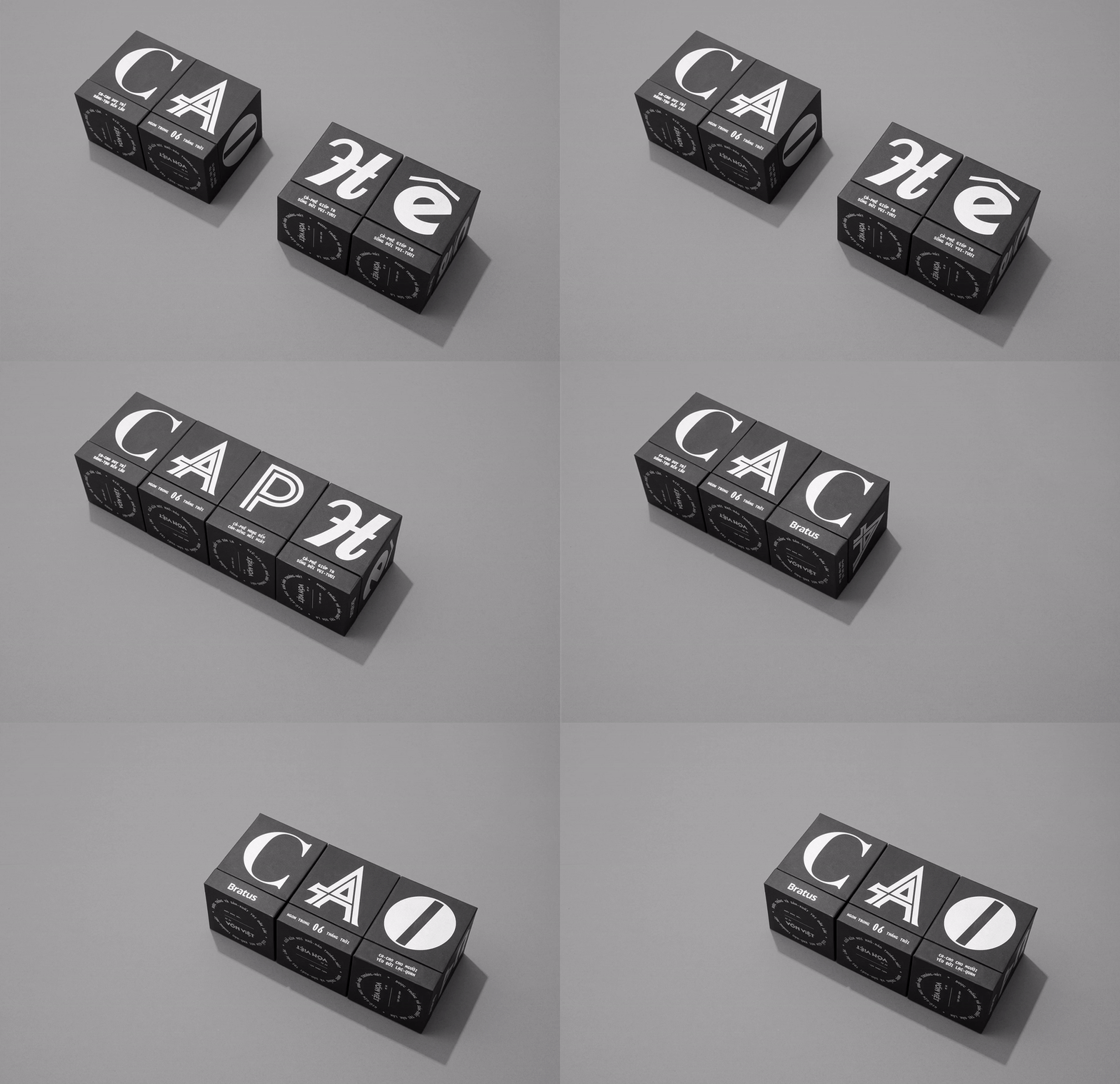
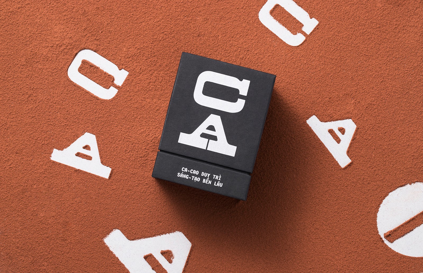
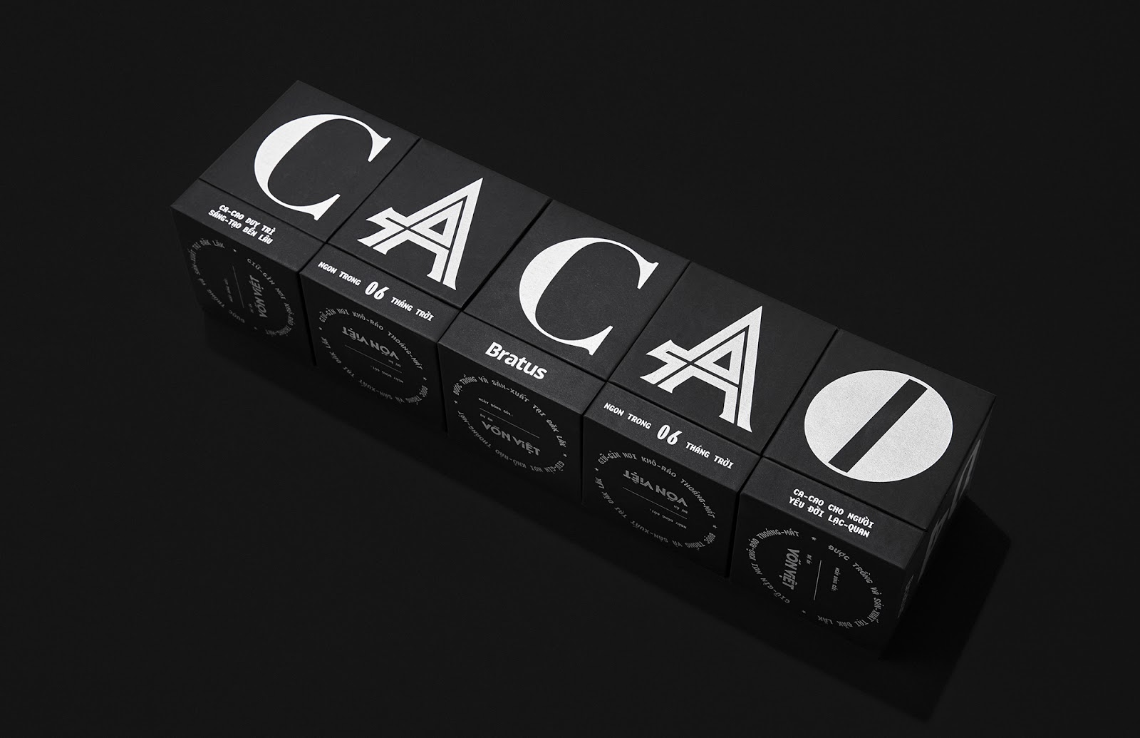
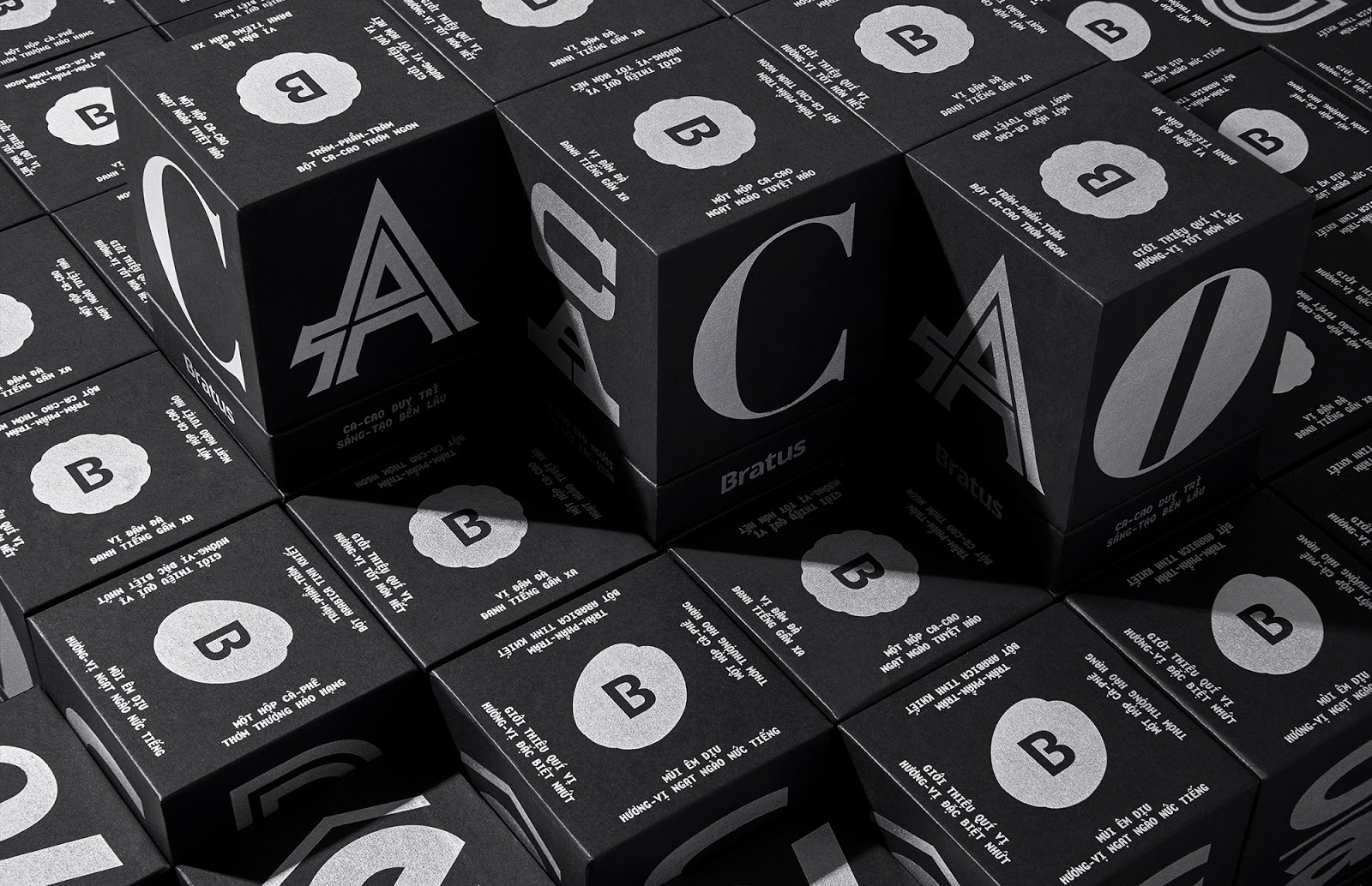
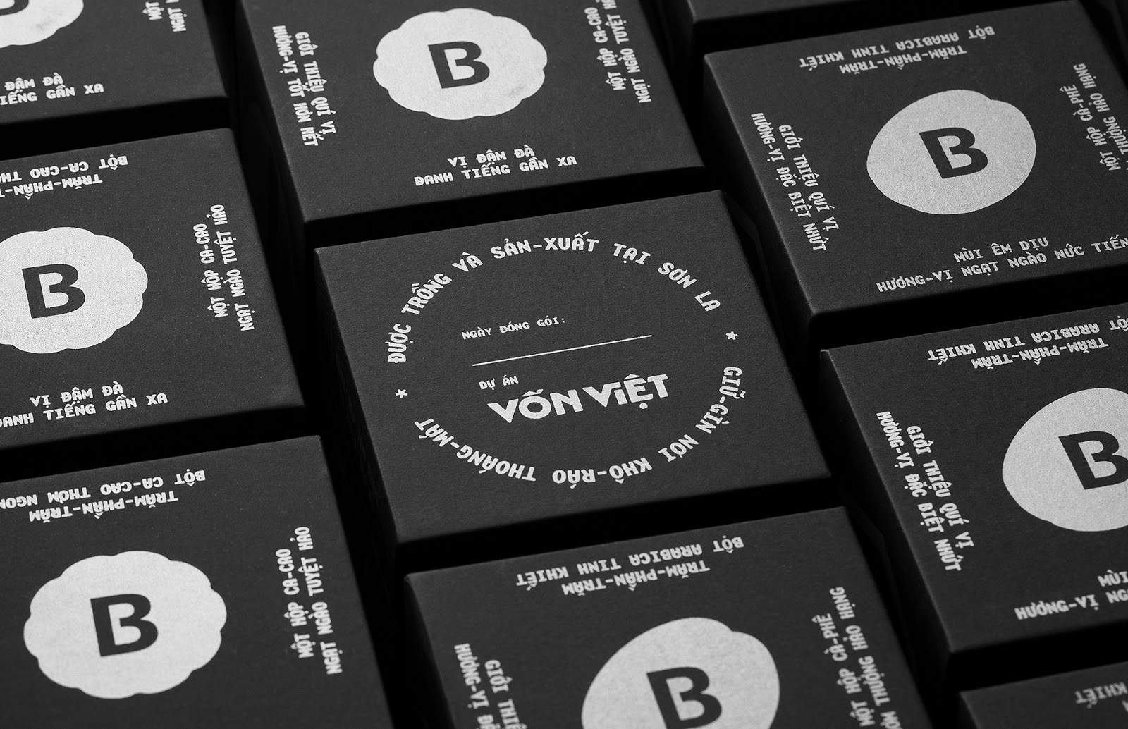
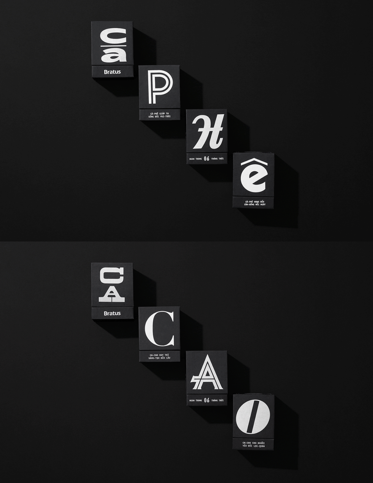
Since we had collected a big precious typeface collection and neither of them was enough to represent the whole era, we determined to recruit all typefaces by selecting random letters from each type and setting them on different faces of the box. That is also the explanation for the project names Mặt – Chữ (Type-faces). The final output becomes a multidimensional artwork spreading out the packaging surface and tells its own historic stories.
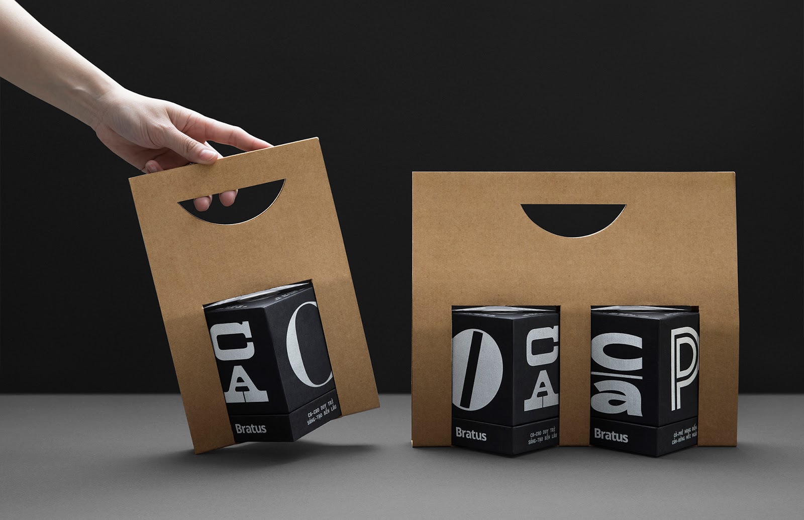
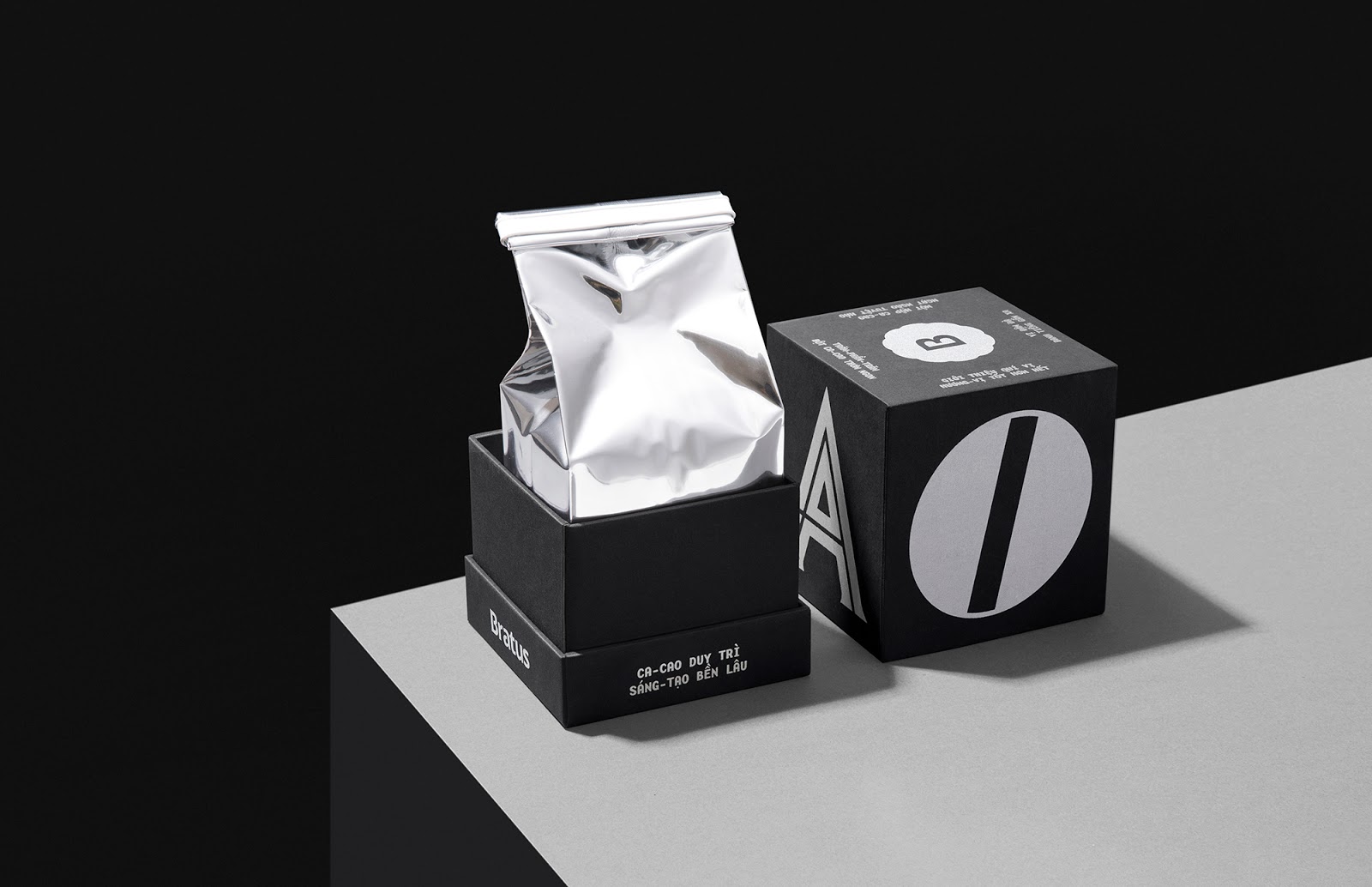
We also invest the silver-foiled silkscreen printing on the quality paper to enhance the result’s experience. To promote convenience and environmental-friendliness, we design an unglued take-away holder with cardboard material. The content of the packaging reflects the verbal language of advertising in old Saigon, with familiar, rustic, and exciting messages.
Mặt-chữ (Type-faces) project not only appreciates the eternal aesthetics and diversity of the previous decades’ typefaces, as well as reminds the constant development of Vietnam’s graphic design and the cultural potential for modern packaging.
方法
尊重古董字体有趣的特征和本质。我们的设计过程是回到过去的旅程,以收集和复活1975年之前在西贡流行的最杰出的字体。我们非常渴望从互联网,文档,书籍,杂志,旧店标语和档案中找到个别信件资源。这项主要研究准备了各种各样的字体,以备我们的实验和探索之用。“最大的挑战是要生产出一种与西贡文化接近,但又现代又最小的有趣包装。”
概念
“此包装是字体库”。
由于我们收集了一大笔珍贵的字体,而且它们都不足以代表整个时代,因此,我们决定通过从每种字体中选择随机字母并将它们放在盒子的不同面上来招募所有字体。这也是项目名称Mặt-chữ (Type-faces) 的说明。最终的输出结果变成了在包装表面上展开的多维艺术品,并讲述了自己的历史故事。
我们还将在优质纸张上进行银丝网印刷,以增强效果。为了提高便利性和环境友好性,我们设计了一种用纸板材料制成的非胶粘外卖支架。包装的内容反映了古老的西贡广告的口头语言,带有熟悉,质朴和令人兴奋的信息。
Mặt-chữ (Type-faces) 项目不仅欣赏了前几十年的字体的永恒美学和多样性,还提醒了越南图形设计的不断发展以及现代包装的文化潜力。
标签:咖啡包装 可可豆礼品包装 汲取灵感 印支派设计 被遗忘的文化遗产 重新思考 字体库 包装表面 越南图形设计 Bratus Agency 有趣包装 西贡广告 现代包装的文化潜力 优质质张 丝网印刷 品牌产品包装设计公司
Copyright By SEALINGAD 2005-2024 All Rights Reserved. 京ICP备11038889号-2 京公网安备11010502007731号
西林设计案例均为西林设计原创, 版权归北京西林品牌产品包装设计公司所有,侵权必究。