tan GC个人护肤品包装设计
时间:2019-08-02 17:14
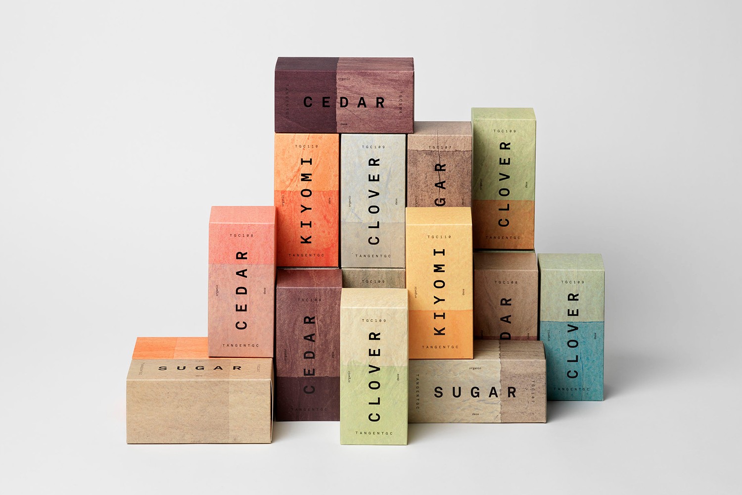
tan GC最初是一家致力于开发长寿产品的有机服装和鞋类护理公司,并于2016年进入了有机护肤品市场。由Essen International TGC s graphic identity设计,通过简单的排版表达,通过没有多余的风格细节和色彩,建立了一个信息直接的视觉系统。这种划分的内容,并从阿库拉特单声道的安排和方向的区别。随着tan GC进入有机个人护肤品市场,他们与伦敦的Carl Nas Associates合作。

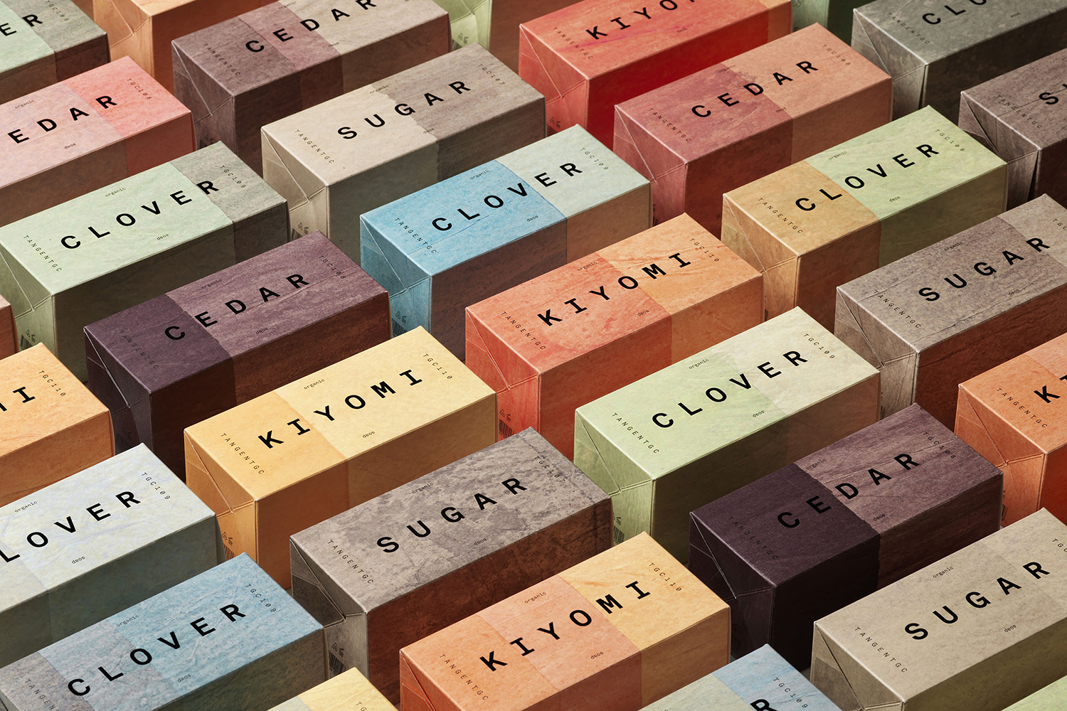
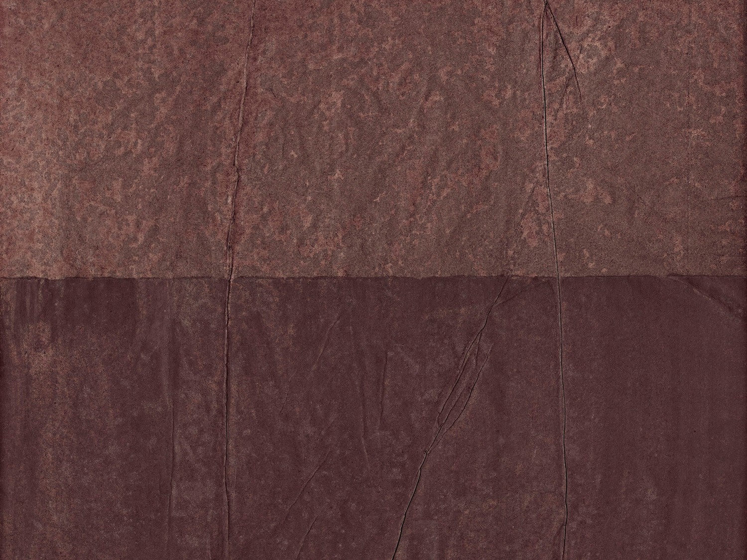
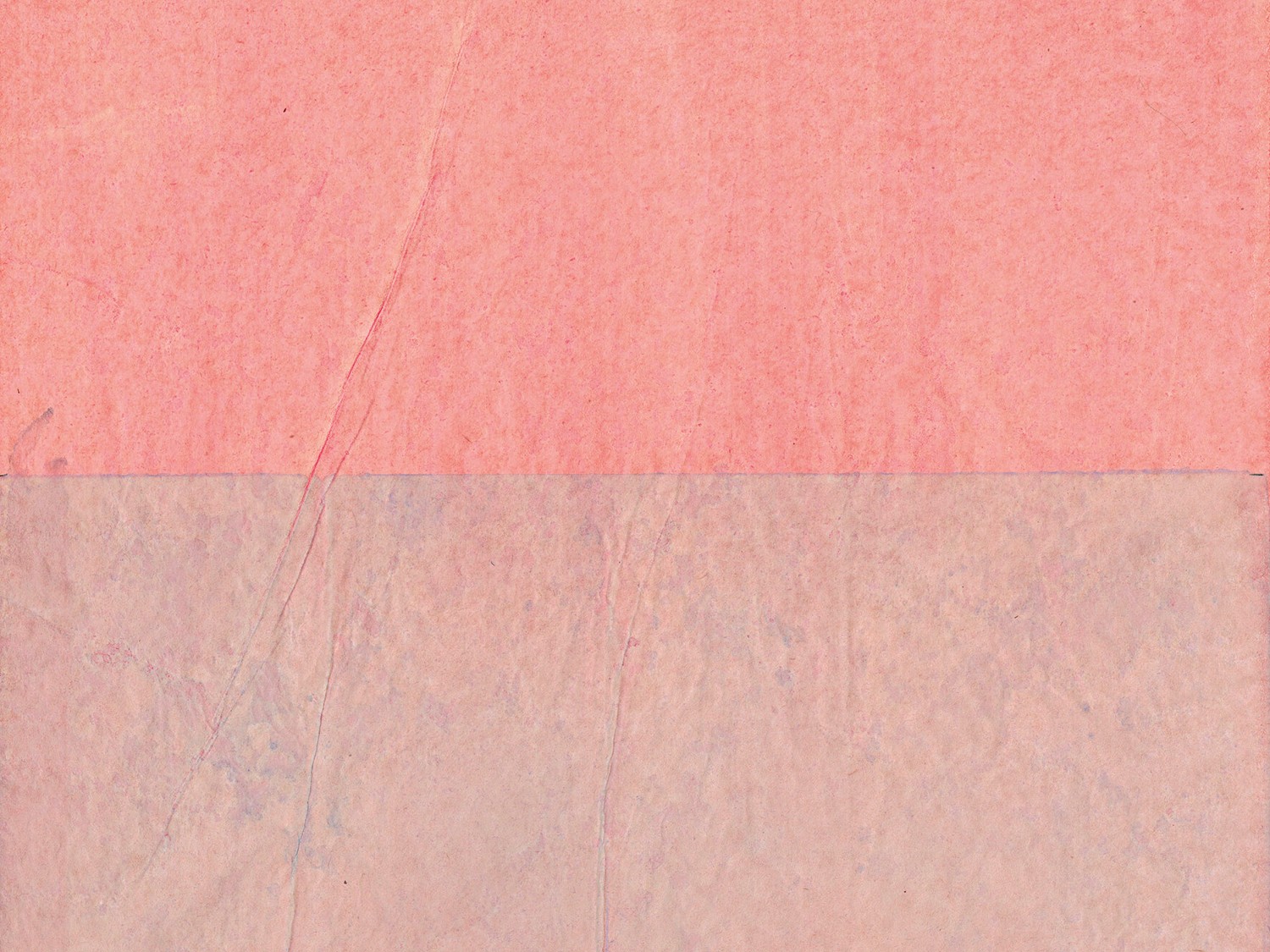
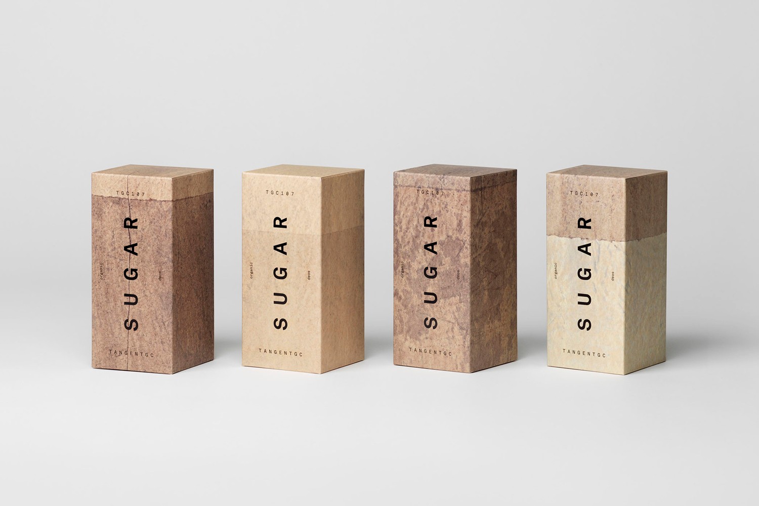
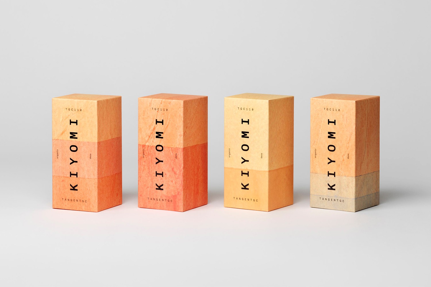
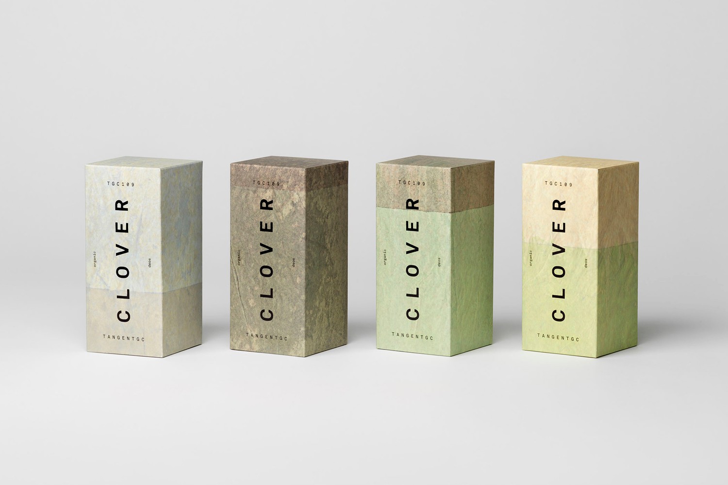
The combination of monospaced type, an abundance of space and the absence of colour quickly communicated the effectiveness of Tangent GC’s garment and shoe care products. The clinicality of type, absence of colour and space then translated well into skincare and provided a identifiable base. The use of campaigns to introduce colour, contrast, texture and artistic expression began to expand the TGC’s visual language, playing with a juxtaposition of the aesthetic alongside the remedial. Check these out here and here. This is developed further in a collaboration with Åsa Stenerhag whose work is characterised by tactile surfaces, colour blocking and low contrast graphic expressions.


As a limited edition range of 100, distributed internationally, and the collaborative nature of the packaging, places the work firmly within the campaign space. Physical products now need to migrate easily online. The special edition, compelling pinnable packaging, is folded into this necessity. The only way some may experience this is online as an image on a blog or a tile on Instagram. Although a material interaction is distant, the use of colour, the evident material implication of the surfaces, function to build an intangible value, a form of associative ornament to the blank canvas of the TGC range. Here, in the same way high fashion and streetwear now interact, collaboration serves as a multiplier. The images build awareness and interest, amplifying brand value. TGC’s visual identity, its positioning as a Swedish organic skincare brand and the surfaces of its packaging are ideal canvases for Åsa Stenerhag.
Design: Carl Nas Associates. Collaborating Artist: Åsa Stenerhag. Opinion: Richard Baird. Fonts Used: Akkurat Mono.


如果你喜欢这个,那么你也可能喜欢:


